居中是 CSS 布局里最常被问到的一块:水平、垂直、水平垂直三套,方案从 text-align、margin: 0 auto 到定位 transform 再到 Flex。下面按效果把能用的写法收齐,并标出继承性和脱离文档流时的坑。
选方案时先问三件事:子元素是否块级、是否已脱离文档流、要不要兼容老浏览器。能用 Flex 就最省事;必须兼容时再退回定位或 table-cell。
| 目标 |
常用方案 |
注意 |
| 水平居中 |
inline-block + text-align;定位 + transform;block + margin: 0 auto;flex |
text-align 会继承;脱离文档流时 margin auto 失效 |
| 垂直居中 |
定位 + transform;table-cell + vertical-align;flex;行高等于高 |
vertical-align 会继承;transform 有兼容问题 |
| 水平垂直 |
定位 + translate(-50%,-50%);table-cell + margin auto;flex 双 center |
Flex 最省,但要考虑兼容 |
一、水平居中
效果如下:

方案一. inline-block + text-align
display: inline-block 的元素带有文本性质,父元素可用 text-align: center 做行内水平对齐。text-align 会继承,内部文字也会居中,需要自身再设一次覆盖。
<style>
    .wrap {
        width: 100%;
        height: 200px;
        background-color: aqua;
        text-align: center;
    }
    .content {
        width: 200px;
        height: 200px;
        background-color: blueviolet;
        display: inline-block;
    }
</style>
<body>
    <div class="wrap">
        <div class="content"></div>
    </div>
</body>
方案二. 定位 + transform
父级开定位(relative / absolute / fixed 均可),子级 absolute 后 left: 50%,再用 transform: translateX(-50%) 回退自身宽度的 50%。父级是否脱离文档流不影响水平居中;transform 是 CSS3,有兼容问题。
<style>
    .wrap {
        position: relative;
        width: 100%;
        height: 200px;
        background-color: aqua;
    }
    .content {
        position: absolute;
        left: 50%;
        transform: translateX(-50%);
        width: 200px;
        height: 200px;
        background-color: blueviolet;
    }
</style>
<body>
    <div class="wrap">
        <div class="content"></div>
    </div>
</body>
方案三. display: block + margin: 0 auto
只改子元素即可。margin 为 auto 时浏览器左右均分。子元素 display 设为 block 或 table 都行;一旦浮动或定位脱离文档流,margin 值会失效。
<style>
    .wrap {
        width: 100%;
        height: 200px;
        background-color: aqua;
    }
    .content {
        width: 200px;
        height: 200px;
        background-color: blueviolet;
        display: table;
        margin: 0 auto;
    }
</style>
<body>
    <div class="wrap">
        <div class="content"></div>
    </div>
</body>
方案四. Flex
<style>
/* flex */
.wrap{
    display: flex;
    justify-content: center;
}
</style>
<body>
   <div class="wrap">
        <div class="content"></div>
    </div>
</body>
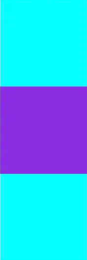
二、垂直居中
效果如下:
方案一. 定位 + transform
和水平方案二同一思路,把 left / translateX 换成 top / translateY。
<style>
    .wrap {
        position: relative;
        width: 200px;
        height: 600px;
        background-color: aqua;
    }
    .content {
        position: absolute;
        top: 50%;
        transform: translateY(-50%);
        width: 200px;
        height: 200px;
        background-color: blueviolet;
    }
</style>
<body>
    <div class="wrap">
        <div class="content"></div>
    </div>
</body>
方案二. display: table-cell + vertical-align
display: table-cell 行为类似 td,子元素布局像文本,父级 vertical-align: middle 即可垂直居中。该属性会继承,父级内文本也会垂直居中。
<style>
    .wrap {
        display: table-cell;
        vertical-align: middle;
        width: 200px;
        height: 600px;
        background-color: aqua;
    }
    .content {
        width: 200px;
        height: 200px;
        background-color: blueviolet;
    }
</style>
<body>
    <div class="wrap">
        <div class="content"></div>
    </div>
</body>
方案三. Flex
<style>
/* flex */
.wrap{
    display: flex;
    /* flex-direction: column;
    justify-content: center; */
    align-items: center;
}
</style>
<body>
     <div class="wrap">
        <div class="content"></div>
    </div>
</body>
方案四. 固定高度等于行高
content 可以是行内或块级元素。
<style>
/* content 可以是行或块元素 */
.wrap{
    height:300px;
    line-height: 300px;
}
</style>
<body>
     <div class="wrap">
        <div class="content"></div>
    </div>
</body>
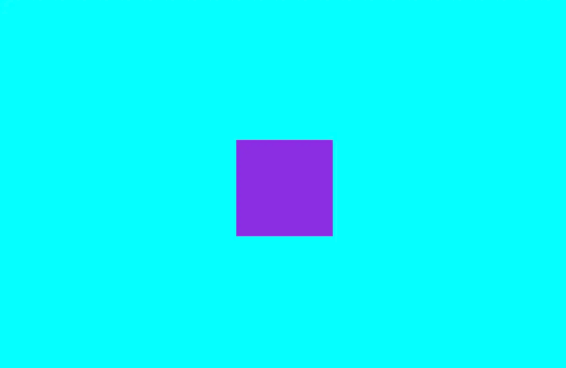
三、水平垂直居中
效果如下:
方案一. 定位 + transform
<style>
    .wrap {
        position: relative;
        width: 1200px;
        height: 800px;
        background-color: aqua;
    }
    .content {
        position: absolute;
        left: 50%;
        top: 50%;
        transform: translate(-50%, -50%);
        width: 200px;
        height: 200px;
        background-color: blueviolet;
    }
</style>
<body>
    <div class="wrap">
        <div class="content"></div>
    </div>
</body>
方案二. 水平方案三 + 垂直方案二
<style>
    .wrap {
        display: table-cell;
        vertical-align: middle;
        width: 1200px;
        height: 800px;
        background-color: aqua;
    }
    .content {
        margin: 0 auto;
        width: 200px;
        height: 200px;
        background-color: blueviolet;
    }
</style>
<body>
    <div class="wrap">
        <div class="content"></div>
    </div>
</body>
四、用 Flex 一次做完
默认交叉轴 align-items: center 垂直居中,主轴 justify-content: center 水平居中。仍要考虑浏览器兼容。
 <style>
     .wrap {
         display: flex;
         align-items: center;
         justify-content: center;
         width: 1200px;
         height: 800px;
         background-color: aqua;
     }
     .content {
         width: 200px;
         height: 200px;
         background-color: blueviolet;
     }
 </style>
 <body>
     <div class="wrap">
         <div class="content"></div>
     </div>
 </body>
原文: https://juejin.im/post/5e91a8a56fb9a03c9037928f#heading-12
一句话总结:水平、垂直、水平垂直都可以用定位加 transform 或 Flex 解决;margin auto 和 table-cell 是兼容备选,记住继承和脱离文档流会让部分方案失效。